How to use price history charts for smarter shopping
TL;DR:
- Price history charts help consumers time purchases and avoid overpaying.
- Free tools like CamelCamelCamel suit casual shoppers, while Keepa offers more detailed data.
- Tracking prices with alerts can save households up to $400 annually by reducing impulse buys.
You add something to your cart, wait a few days, hit buy, and feel great about it. Then two weeks later, you see the same item on sale for 30% less. That stings. The good news? That situation is almost completely avoidable. Access to price history and alerts reduces impulse buys by 33% and can save an average household $200 to $400 per year. This guide walks you through what price history charts are, how to read them, which tools to use, and how to avoid the mistakes that quietly cost you money.
Table of Contents
- What are price history charts and why use them?
- Choosing the right price history tool for your needs
- How to read and interpret a price history chart
- Common mistakes and how to avoid them
- Why most shoppers overlook the real power of price charts
- Get started and save more with price tracking tools
- Frequently asked questions
Key Takeaways
| Point | Details |
|---|---|
| Understand chart basics | Knowing what price history charts represent helps you identify genuine deals and avoid paying more than necessary. |
| Choose the right tool | Most cost-conscious shoppers get plenty of value from free options, but power users may prefer premium features. |
| Act on evidence, not impulse | Timing your purchase based on chart data can save $200–$400 a year and reduce impulsive shopping. |
| Avoid common pitfalls | Watch for incomplete charts and always set clear alert thresholds to maximize your savings. |
What are price history charts and why use them?
Now that we’ve previewed why tracking price history can transform your online shopping, let’s break down what these charts actually are and why they’re so effective.
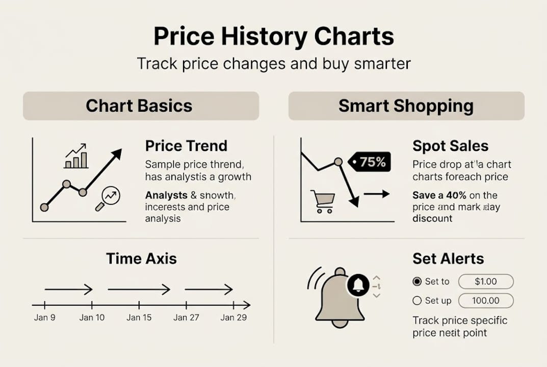
A price history chart is a visual graph that shows how the price of a specific product has changed over time on a retailer’s website. Think of it as a financial chart, but instead of stocks, you’re watching the price of a laptop or a blender move up and down over weeks or months. That data tells you a story that a product page never will.
Price history tools like CamelCamelCamel and Keepa track Amazon price trends so you can make smarter buying decisions. Both are well-known and widely used. CamelCamelCamel (often called CCC) is completely free and shows you price lines for Amazon sold items, third-party new, and used options. Keepa offers a deeper feature set, including international tracking and browser extensions, with some premium capabilities locked behind a subscription.
Here’s a quick side-by-side look:
| Feature | CamelCamelCamel | Keepa (Free) | Keepa (Premium) |
|---|---|---|---|
| Price history charts | Yes | Yes | Yes |
| Price alerts | Yes | Yes | Yes |
| Browser extension | No | Yes | Yes |
| Historical data depth | Limited | Moderate | Extensive |
| Cost | Free | Free | Paid |
So why does any of this actually matter? Because online retailers adjust prices constantly, sometimes multiple times per day. Without a chart, you have zero context. You’re buying blind. And that’s exactly how you end up overpaying.
Here’s what understanding price history gives you as a shopper:
- Confidence that you’re paying a fair price
- Patience to wait for a genuine low rather than a fake sale
- Evidence to compare across sellers and time periods
- Savings by timing purchases around proven discount cycles
- Fewer regrets from impulse purchases made at inflated prices
In short, this chart becomes gold when you know how to read it. And reading it is easier than most people think.
Choosing the right price history tool for your needs
Understanding the value of these charts, the next step is picking a tool that matches your approach to shopping and saving.
Charts from CamelCamelCamel are easy and free, while Keepa offers more data with a premium tier. Which one should you use? It depends on how deep you want to go.
For most casual shoppers tracking everyday purchases, CCC is all you need. The interface is clean, the data is clear, and it costs nothing. You paste a product URL, and within seconds you see a full price history chart. No learning curve, no subscription.
Keepa is better for shoppers who want more control. It integrates directly into Amazon product pages via a browser extension, showing the price chart right below the product listing. This is convenient but does require a browser add-on, which some people prefer to avoid.
| Tool | Best for | Extension available | Price |
|---|---|---|---|
| CamelCamelCamel | Beginners and casual shoppers | No | Free |
| Keepa (Free) | Regular shoppers wanting more data | Yes | Free |
| Keepa (Premium) | Power users and deal hunters | Yes | Paid subscription |
Here are a few things to consider before you pick:
- Simplicity: CCC wins if you want something quick with no setup
- Integration: Keepa’s browser extension shows charts directly on Amazon
- Depth of data: Premium Keepa tracks more history and includes sales rank data
- Cross-store tracking: Look into tools built for multiple store types if Amazon isn’t your only retailer
Pro Tip: Start with a free tool. If you find yourself wanting more granular data, longer history, or cross-platform tracking after a few weeks, then consider upgrading. Most shoppers never need to.
The bottom line is this: the best tool is the one you’ll actually use. A premium tool you never open is worse than a free one you check regularly.
How to read and interpret a price history chart
Once you’ve chosen your tool, it’s crucial to understand exactly what these charts are showing you and how to use that data to time your purchases.
Here’s how to get started step by step:
- Open your chosen tool (CamelCamelCamel or Keepa) in your browser.
- Find the product you want to track on Amazon and copy its URL.
- Paste the URL into the tool’s search bar and hit enter.
- Review the chart lines: Amazon price, third-party new, and used are typically color coded.
- Look at the full range: Zoom out to see six months or a full year of history.
- Identify the lowest price ever and compare it to today’s price.
- Set an alert at or below your target price so you get notified automatically.
In CamelCamelCamel, paste the Amazon URL to view charts showing Amazon, new, and used prices, and set alerts below your desired price. It really is that straightforward.

Here’s a simple guide to what you’re seeing in the chart:
| Chart element | What it means |
|---|---|
| Sharp price drop | Likely a sale or clearance event |
| Gradual price rise | Possible demand increase or stock shortage |
| Flat line | Price has been stable; may not go lower soon |
| Spike then drop | Common before and after major sale events |
One pattern to watch closely: retailers often raise prices right before big sale events like Black Friday or Prime Day, then drop them just enough to look like a deal. A chart exposes this immediately.
Pro Tip: Look for steep drops in the chart that happened around the same time last year. If a product dropped 20% in November before, it may do the same again. Use setting up price alerts to get notified before you miss it.
Using the chart alongside your best price tracking strategies turns passive browsing into active, data-backed decisions.
Common mistakes and how to avoid them
Even with the best tools and insight, some common mistakes can undercut your savings. Here’s how to spot and avoid them.
Let’s be honest: most people look at a price history chart once, see a low number, and feel like experts. But there are real traps that cost you money if you’re not careful.
Here are the biggest mistakes shoppers make:
- Only checking the Amazon price line. If third-party sellers are offering the same item cheaper, you’re missing the full picture.
- Not tracking long enough. Looking at two weeks of history when six months of data exists is like reading only the last page of a book.
- Misreading rapid price changes. A sudden drop might be a data error or a short-lived flash deal, not a true new low.
- Setting one alert and forgetting it. Prices move in steps. Setting alerts at multiple price points gives you more opportunities.
- Ignoring price drop alert signals that come through but seem minor. Small drops on expensive items add up fast.
Using price history and alerts can reduce impulse buying by up to 33%, but that benefit disappears if you act on incomplete or misread data.
Pro Tip: If your tool allows it, set two or three alerts at different price thresholds for the same product. That way, you catch deals even if the price only drops partway to your ideal target.
“Data-driven patience is what separates shoppers who occasionally score a deal from those who consistently pay less. The chart is telling you the truth. Trust it.”
Another underrated move: cross-check prices on why tracking price history matters to understand not just when prices dropped, but why. Context turns data into real insight.
Why most shoppers overlook the real power of price charts
Here’s something most articles won’t say: price history charts aren’t just for bargain hunters. That’s a misconception that keeps a lot of people from using one of the most powerful tools available to any consumer.
The real power isn’t about being cheap. It’s about control. When you can see the true value of price tracking laid out in a visual chart, you stop reacting to marketing and start making decisions based on actual market behavior. That shift in mindset is worth more than any single discount.
We’ve watched market cycles for years. And here’s what stands out: emotional shopping is expensive shopping. The urgency you feel during a flash sale? That’s manufactured. The chart strips that away completely. You either see a real low or you don’t.
Price charts give you something most financial tools don’t: clarity in real time, on the things you’re actually buying. That’s financial empowerment hiding in plain sight.
Get started and save more with price tracking tools
Ready to take action? Here’s how you can start making price history charts work for you.
You’ve got the knowledge. Now it’s time to put it to work. PriceLix makes it easy to track prices across Amazon, eBay, Walmart, and over a thousand other stores, all from one clean dashboard. No browser extension needed. Just add a product, set your target price, and let the platform handle the daily checks.
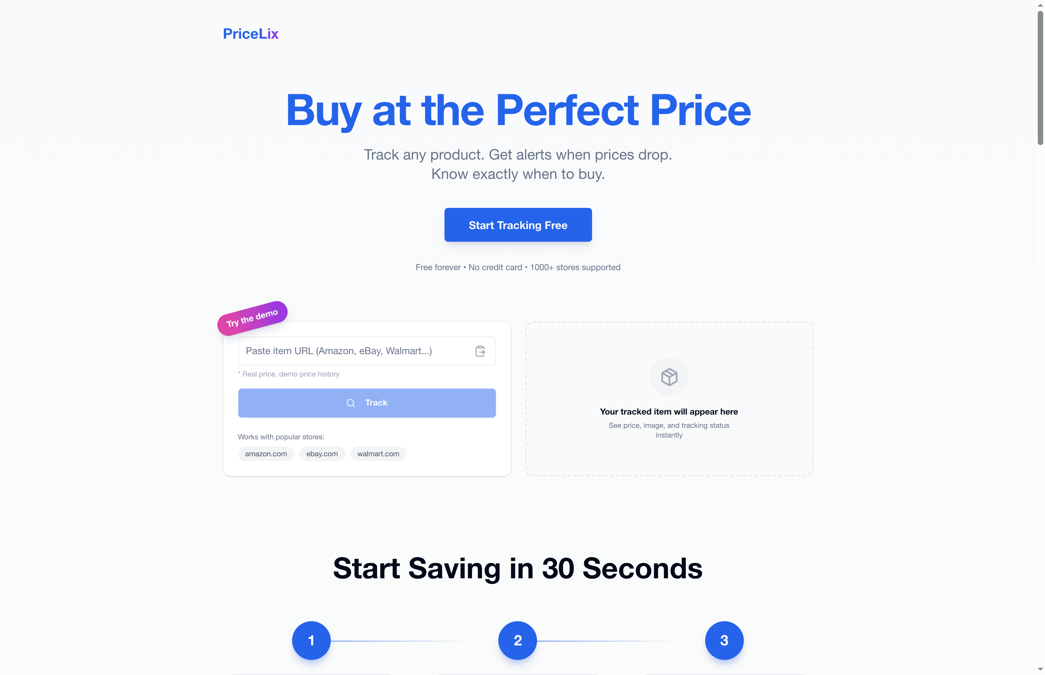
If you’re ready to stop overpaying and start shopping with real data behind you, getting set up takes less than a minute. Follow these price drop alert setup tips to configure your first alert today. The $200 to $400 in annual savings is waiting. The only thing left is to go get it.
Frequently asked questions
How do I access a price history chart for an Amazon product?
Copy the Amazon product URL and paste it into CamelCamelCamel or Keepa to view the full price history chart instantly, including Amazon, third-party new, and used prices.
Do I need to pay for price history chart tools?
Most shoppers do just fine with free tools. Free tools like CamelCamelCamel are simpler but get the job done for everyday tracking, while Keepa’s premium tier adds more depth for power users.
How much money can I save by using price history charts?
Families who track prices and time their purchases strategically can save an average of $200 to $400 per year, based on reduced impulse buying and better timing.
Can price history charts work for sites other than Amazon?
Most major tools like CamelCamelCamel are built primarily for Amazon, but some platforms track additional retailers. Always check the supported store list for whichever tool you choose before committing.
Recommended
- Price history charts: save money tracking product prices | PriceLix
- Why Tracking Price History Matters for Smart Shoppers | PriceLix
- Top 7 advantages of price history tracking for smart shoppers | PriceLix
- Why price history transforms online shopping in 2026 | PriceLix
- Warum Schnäppchen so beliebt sind: Psychologie & Nutzen MonsterDealz.de